BPMN 2.0: How to Map a Business Process Step by Step
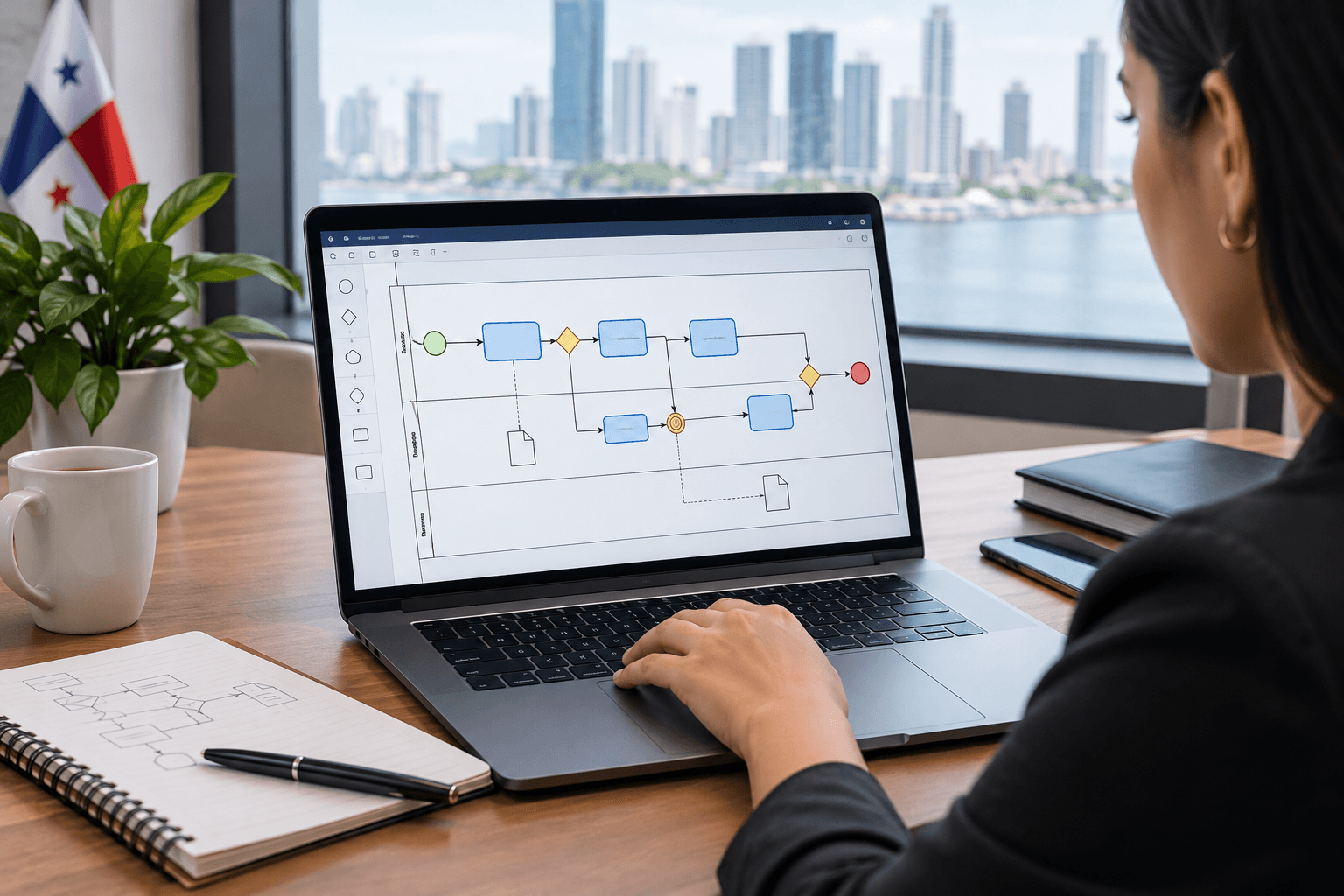
Almost every process diagram I come across has the same problem: it looks good and it is useless. Boxes connected by arrows, with no indication of who does what, no sign of what happens when something fails, and no distinction between a decision and a task.
BPMN 2.0 exists to solve that: it is a standard notation that makes two different people read the same diagram the same way. Its bad reputation comes from having more than a hundred elements. The good news is that six cover nearly everything.
The six elements you need
Start event. A thin-line circle. What triggers the process: a request arrives, a deadline expires, a client signs.
Task. A rounded rectangle. Work somebody does. Name it with a verb plus an object: "Validate documentation", not "Documentation".
Exclusive gateway. A diamond with an X. A decision with mutually exclusive paths. Each output is labelled with its condition: "approved" / "rejected". A gateway without labels is a half-finished diagram.
Sequence flow. The arrow. The order.
End event. A thick-line circle. And here is the first piece of advice that changes diagrams: a process has more than one ending. The happy one and the others. If your diagram only ends well, it is not complete.
Lanes. The horizontal bands saying who executes each task. Without lanes the diagram documents steps rather than responsibilities, and most problems sit precisely at the handoff between lanes.
With those six you can map the bulk of the administrative processes in any organization.
How to capture the real flow
Choose the scope and state it. Where it starts and where it ends. The discussion about scope usually takes longer than the drawing, and skipping it produces diagrams that grow without control.
Gather the people who execute. Not their managers. The manager describes the process as it should be; whoever runs it describes it as it is. They are two different processes and the second is the one to map.
Draw the happy path first. From start to end with no exceptions. It is usually between seven and fifteen tasks. If you end up with forty, the scope was too broad.
Add the decisions. Every point where the flow branches. This is where the first surprise appears: paths that exist in practice and nobody had documented.
Add the alternative endings. What happens when something is rejected, when a document is missing, when the client does not respond. This step is what turns a drawing into a tool.
Mark waits and handoffs. Where something sits waiting for someone else. Bottlenecks live there, almost never inside a task.
Validate with another person from the team. If somebody who was not in the session can follow the diagram and recognize their work, it is well done.
A warning about tools
The temptation is to open modelling software from minute one. Do not, in the first session.
A whiteboard and sticky notes let you move a task between lanes without thinking twice, and during the initial capture that happens constantly. When somebody is wrestling with software in front of six people, the session loses rhythm and the team disengages.
Move the diagram into a tool afterwards, once the flow is validated. Any editor supporting BPMN 2.0 works; what matters is that it exports to a format you can version and that the rest of the organization can open without a licence.
How much detail is enough
The most frequent question, and the answer depends on why you are mapping.
To understand and improve, task level is enough: "Validate documentation" without breaking down the seven fields being checked.
To train somebody new, you need one level deeper, but that belongs in a written procedure, not in the diagram.
To automate, the detail is exhaustive, including systems and the input and output data of each task.
A diagram with fifty boxes is not more rigorous: it is unreadable. If it does not fit on one screen, split it into subprocesses.
Diagram quality checklist
- The scope is written down: where it starts and where it ends.
- There are lanes and each task sits in the lane of whoever really executes it.
- Tasks are named with a verb plus an object.
- Every gateway has its outputs labelled with the condition.
- Alternative endings exist, not only the happy path.
- Waiting points and handoffs between lanes are marked.
- The diagram fits on one screen; if not, there are subprocesses.
- Somebody who was not in the session understood it without explanation.
If you fail on 2 or on 5, the diagram is not yet useful for improving anything.
Why it matters in a regulated environment
In banking this stops being good practice and becomes evidence.
Agreement 011-2018 of the Superintendency of Banks requires identifying, measuring, mitigating, monitoring and controlling operational risk. Identifying operational risk without having mapped the process is guesswork: risks appear at handoffs, at waits and along alternative paths, which is exactly what a well-made BPMN diagram makes visible.
In the banks where I have worked, process mapping ended up serving two purposes at once: improving operations and supporting the risk matrix before the supervisor. One effort, two audiences.
It is also worth being clear about the standardization framework: the DGNTI, part of the Ministry of Commerce and Industries, is "the national standardization body, which acts in the elaboration, adoption or adaptation of standards in the field of industry, commerce and services". BPMN is not a Panamanian standard, it is an international notation standard, but the two planes should not be confused when documenting a management system.
Common mistakes
Mapping the ideal process. You draw how it should be and discover during implementation that nobody works that way.
Diagrams without lanes. They document steps and hide responsibilities, which is where the problem lives.
Unlabelled gateways. A diamond with two arrows and no condition says nothing.
A single ending. The real process has rejections, returns and abandonments. If they are not there, they cannot be improved.
Excessive detail. Fifty boxes for an approval process guarantee nobody reads it.
Mapping and filing. A diagram not used to decide anything goes stale within weeks.
Where to start
Pick a process that hurts, gather three people who run it and spend two hours. With the six elements above and a whiteboard you will have more than most organizations have documented.
You can see how we approach redesign in process design and the wider practice in process optimization. If you want the methodological frame around mapping, it is in our guide on what BPM is.
Want us to review a process with you? Book a free 15-minute assessment.

CEO, Grupo Alternative
Katherine González
PMP® | ISO 9001 Lead Auditor | MBA
I've spent 15 years helping companies in Latin America optimize their processes. I've seen how BPM transforms companies from within—reducing costs, accelerating growth, and improving the quality of life for teams.
Share this article